A2 MEDIA STUDIES
DIGIPAK analysis

ANALYSIS FRONT COVER
COLOUR:
She has used a photo of her as the background and on top of it she has added a red layer, on the center we can see the RED letters standing out. This makes it more eye catching and it makes the audience want to purchase the album. Her name is represented in a white colour because it makes it stand out from the background and gives a sense of cleanliness which shows the elegance she has.
WORDING/FONT:
The font changes depending on the word, for example the font of the title appears in big letters, that occupy most of the cover to make sure it is seen well. However, her name appears in bold but much smaller so that it can be seen but does not detract the title.
CHOICE OF IMAGES:
There is a close up of the artist's face, however we cannot see her whole face in the image as she is obscured by the shadow. The shadow helps to stand out the portrait of Taylor Swift as it makes her look mysterious. The fact that we can only see a bit of her face and still recognise her, shows how famous she is to the audience. The shadow also makes her red lipstick stand out because the top of her head is represented with a dark tone while the bottom of her face is represented with bright light. This is a way os creating a link between the red of the lipstick that she is wearing, with the name of the album in order to represent that the album is about her.
DESIGN/LAYOUT:
The design of the front cover is just as simple as the back cover however it is a way of not making it too exaggerated. Audiences prefer simple albums as they are easier to read and because it makes it look much more elegant with few things. The design is very creative as it has included a red layer on top of the photo which makes it much more original.
ANALYSIS CD
COLOUR:
The colour theme of the CD is full red but in order to make it look much more elaborated she has used two types of red. The whole CD is covered with the same tone of red as the one used for the front cover. Then she has added dark red lines that match with the title of the album and her name, so we can easily differentiate it from the background.
WORDING/FONT:
In the CD they have used the same typography for the title and the name, however the title has been made bigger than the name to make it stand out more.
DESIGN/LAYOUT:
The dark red lines she has included in the CD match with the lines of the back cover. She has decided to make the CD in a red colour so it matches with the rest of the digipak.
ANALYSIS BACK COVER
COLOUR:
She used a dirty white tone which contrasts with the bordeaux eye catching colour of the letters. The dirty white is a colour that represents calm and this has been chosen because some of her songs transmit calmness however other have a quicker beat. This is why they have made a contrast between the two colours, in order to represent the two types of songs she produces. The dirty white also represents elegance which has been chosen on purpose as she is also always trying to communicate perfection.
WORDING/FONT:
In order to make the name of her songs stand out she has used a red colour in order to make them contrast. As the album is called RED she has created a link between the colour of the songs and the title so it makes sense. The title also repeats in the back of the album and it appears in red bold colour in order to make reference to the name of the album. She has added her name in white letters to again make it contrast and to make it match with the colours of the front cover.
CHOICE OF IMAGES:
In the back cover she has chosen a image of her, where she is standing up and her arm fits perfectly with the corner of the album. She has done this to simulate that her arm is holding both the name of the album and her name. The clothes she is wearing is nearly the same as the background of the cover, therefore it matches, again creating a link. Her lips stand out as they are in the same red colour as the name of the album. They way in which she is wearing sun glasses represents confidence, what she is exactly trying to show through the album.
DESIGN/LAYOUT:
The design is simple but it is well distributed as the songs appear in the center of the album because they are the main purpose of the album. The name of the album (RED) and her name are placed next to her photo to show that she is the artist and how powerful she is.


ANALYSIS FRONT COVER
COLOUR:
She has decided to use a mix of colours such as blue, red and especially pink. She has chosen pink as the main colour because it is a colour that is associated with femininity and this links to why she is lying on a pink cloud. Pink is a colour that symbolises delicacy, kindness and sweetness. Therefore she has created a link between her songs and her front cover so the audience understand what kind of genre she makes. In this case Katty Perry produces pop music and that's why the colours she uses are bright.
WORDING/FONT:
In this album Katy Perry's name is written bigger than the title, so it means that in this case who she is has more importance than the album itself. The name Katy Perry is written inside a balloon, this is a way of representing freedom so it implies that you are going to feel free and yourself when listening to it. For the title of the song they have used a more creative typography as each letter is made of sugar cane. This gives a sense of sweetness to the album and connects with the vibe Katy Perry wants to convey.
CHOICE OF IMAGES:
The main image on the digipak front cover is of Katy Perry and can be interpreted as sensual by the audience because she is lying unclothed while some parts of her body are being covered up by the pink cloud. In this way it can attract men to buy the album and therefore increase the number of sales. As the image of Katy Perry is quite provocative it means that it is aimed at an older audience and this is why it has the "Parental Advisory Explicit Content" logo.
DESIGN/LAYOUT:
The design is quite simple but the layout is very engaging. The variety of colours they have used makes the cover very attractive and therefore makes people take notice.
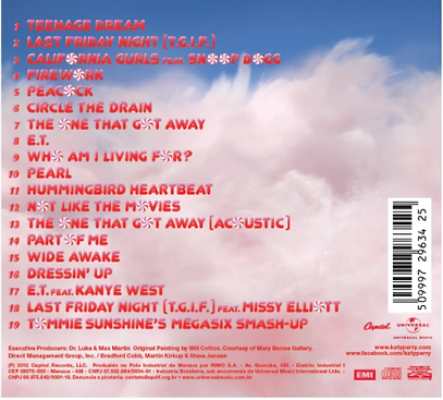
ANALYSIS BACK COVER
COLOUR:
The track playlist has been done in red typography in order to directly engage the audience's attention towards the song titles. Therefore the songs titles are in bold in order to contrast against the light pink of the background. The blue colour that appears in the front cover has also been used to inform the audience about the bonus CD included in this digipak on the back cover.
WORDING/FONT:
The typography used to represent the song titles is bigger and much more creative and this is why it stands out from the rest of phrases. The people who have helped produce the digipak have been added below but it appears in a small font. This shows that the songs titles are much more important than the rest.
DESIGN/LAYOUT:
The design of the back cover is very well thought out, because they have added a circular red and white sweet on the songs titles in order to replace the letter "O". Therefore the colours symbolise the sweetness and positivity of Katy Perry's songs.
ANALYSIS CD
COLOUR:
The colours used for the CD are red and white, this colours make the CD very attractive and eye catching for the taregt audience. The brightness of the colours links to the pop music genre Katy Perry creates.
WORDING/FONT:
Normally the name of the artist appears on the CD, but since Katy Perry is very popular there is no need to have her name on every part of the digipak.
DESIGN/LAYOUT:
The design of the CD supports the theme the digipak has created of sweets and treats because they have represented the CD with a lollipop.
